TL;DR:
- Effective med spa websites prioritize trust signals, fast booking, and mobile optimization to boost conversions.
- Treatment pages should feature clear visuals, credentials, transparent pricing, and patient testimonials.
- Continuous UX testing and refining are essential for maintaining and increasing client engagement and bookings.
Most med spa websites look beautiful on the surface but quietly bleed bookings every single day. The problem is rarely the photography or the color palette. It is the invisible stuff: the friction in your booking flow, the missing trust signals on your treatment pages, the hero section that loads slowly on a phone. UX design in med spas is fundamentally about balancing luxury aesthetics with medical credibility to build the trust that converts curious visitors into scheduled appointments. This guide gives you the frameworks, data, and practical steps to close that gap and turn your website into your best-performing staff member.
Table of Contents
- Core principles of UX design for med spas
- UX frameworks: Mapping the med spa client journey
- Optimizing treatment pages: Trust, visuals, and engagement
- Booking conversion: UX features that drive more med spa appointments
- Why “just looking good” isn’t enough: A UX perspective for med spa growth
- Take your med spa website further with expert UX design
- Frequently asked questions
Key Takeaways
| Point | Details |
|---|---|
| Trust-building is critical | Incorporate credentials, testimonials, and transparent processes to win client confidence from first visit. |
| Visuals drive impact | Use premium imagery and before/after galleries to engage and reassure clients instantly. |
| Online booking boosts results | Offering seamless booking converts more leads, especially after-hours or on mobile devices. |
| Mobile optimization is essential | 71% of med spa website visits are mobile, so responsive, fast design is non-negotiable. |
| Continuous UX updates pay off | Regular UX improvements lead to measurable gains in conversions and client satisfaction. |
Core principles of UX design for med spas
Your website makes a first impression faster than a blink. Research consistently shows that first impressions form in 50ms and are 94% visual, meaning most visitors decide whether to stay or leave before reading a single word of your copy. That is a brutal standard, and most med spa sites fail it by defaulting to stock photography or overly clinical layouts that feel more like a hospital intake form than an upscale wellness destination.
The concept of “medical luxury” sits at the heart of strong med spa UX. Think of it as a dial with two extremes. Turn it too far toward clinical and you repel the aspirational clients who want to feel pampered, not processed. Turn it too far toward spa and you erode the medical credibility that makes people trust you with their faces and bodies. Balancing these competing signals requires soft neutral palettes, clean serif or humanist typography, and a layout that feels both indulgent and safe.
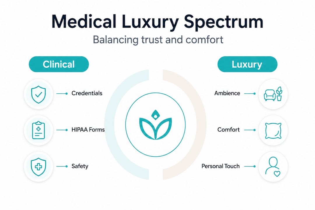
Here is what the data says about the four non-negotiable elements every med spa homepage must nail:
| Element | Why it matters | What happens if you skip it |
|---|---|---|
| Premium hero image | Visual trust is formed in 50ms | Bounce rate exceeds 65% |
| Provider credentials | Establishes medical authority | Visitors question safety |
| Prominent booking CTA | Online booking converts 2.3x over call-to-schedule | Leads drop to competitors |
| Mobile optimization | 71% of traffic is mobile | Majority of visitors get a broken experience |
Strong visual content for med spas does not just mean beautiful photos. It means intentional imagery that signals both luxury and expertise simultaneously. A photo of a provider in a clean white coat, working in a beautifully lit treatment room, communicates both dimensions at once. Clients approaching their first aesthetic treatment often consult a clinic selection checklist before committing, and your site needs to answer every question on that list before they even ask it.
Pro Tip: Run a five-second test by showing your homepage to someone unfamiliar with your brand. Ask them what services you offer and whether they would trust you with a cosmetic treatment. If they hesitate on either question, your hero section needs work.
Now that we understand the impact of UX fundamentals on the med spa experience, let us break down how these principles are applied in real website features.
UX frameworks: Mapping the med spa client journey
Clients do not arrive at your booking page in a straight line. They navigate a layered research process that starts with a concern or a treatment search and winds through reviews, treatment comparisons, credential checks, and price evaluations before they ever hit “schedule.” Each of those stages is a potential drop-off point, and each one requires a specific UX response.
The six stages of the med spa digital journey look like this:
- Search and discovery: The client types “Botox near me” or “best med spa in [city].” Your SEO and site speed determine whether they even find you.
- Homepage impression: They land and form a trust judgment in under a second based on visuals and layout.
- Treatment research: They click into a service page to understand what a procedure involves, how long it takes, and what recovery looks like.
- Trust review: They look for proof: before/after photos, provider bios, testimonials, and any credentials or certifications.
- Inquiry or consultation request: They want to ask a question or take a next step without feeling pressured.
- Scheduling: They book. This step must be frictionless, fast, and available at any hour.
The anxiety peak is stage three. Treatment pages carry the heaviest psychological weight because the client is imagining themselves in the chair. This is where you need to front-load reassurance. Provider bios with real credentials, honest before/after galleries with consent disclosures, and patient testimonials specific to that treatment all reduce the fear that keeps people from booking. Building strong sales strategies for med spas means treating that treatment page as your most important sales conversation, not just a product description.
| Journey stage | Client mindset | Key UX response |
|---|---|---|
| Search | “Does this place exist and rank well?” | Fast site, strong SEO, clear location |
| Homepage | “Can I trust this place?” | Premium visuals, credentials, booking CTA |
| Treatment page | “Is this right for me and is it safe?” | Before/after, bios, pricing, process info |
| Trust review | “What do real clients say?” | Testimonials, reviews, consent transparency |
| Scheduling | “Is this easy?” | Frictionless online booking, real availability |
Developing strong content ideas for med spas that map to each journey stage ensures your website is working across the entire funnel, not just at the top or the bottom.
Pro Tip: Use Google Analytics to find which treatment pages have the highest exit rates. Those are your anxiety peaks. Add a provider bio, a specific testimonial, or a brief FAQ block to those pages and watch your engagement metrics improve.
Optimizing treatment pages: Trust, visuals, and engagement
Now that we understand how user journeys shape design, the next step is refining the core pages where clients make their decision: your treatment and service pages.
Before/after photo galleries drive 92% engagement on treatment pages when they are organized by treatment, scannable, and paired with brief outcome descriptions. The structure that converts best puts results first, meaning the gallery and key outcomes appear above the fold, followed by the clinical details, pricing, downtime information, and the provider profile. Most med spa sites do this in reverse, burying the emotional proof that motivates action under walls of clinical text.
“Trust is not built with a single element. It is the accumulation of credentials, transparency, real results, and clear process that tells a first-time client they are in good hands.”
Transparent pricing is another factor that most med spa sites get wrong. Hiding pricing behind a “call for pricing” prompt costs you real leads, often as much as 40% of potential inquiries who simply click away to a competitor who shows their numbers. Pricing does not have to be exact. Showing a starting price or a treatment range communicates transparency and gives clients the context they need to decide whether to take the next step.

HIPAA-compliant forms and consent processes are not just legal requirements. They are trust signals for aesthetic clinics that signal professionalism and care. When a client sees a consent notice on a before/after gallery or a properly structured intake form, it tells them your practice takes their privacy seriously. That kind of institutional credibility is hard to fake and easy to display.
Here are the core elements every treatment page must include:
- Before/after gallery organized by treatment type, with consent disclosures visible
- Provider bio specific to the treatment, including credentials, training, and experience
- Transparent pricing showing at minimum a starting price or range
- Downtime and recovery information written in plain, honest language
- Patient testimonials tied to the specific treatment, not just generic praise
- HIPAA-compliant contact or consultation form positioned near the bottom of the page
- Clear, high-contrast booking CTA that appears at multiple points on the page
A well-structured photo gallery setup for med spas is one of the highest-return investments you can make in your website. When clients research procedures like lip enhancement, they are making deeply personal decisions. Real, honest galleries with consent notices build the exact kind of trust that moves someone from “maybe” to “booked.”
Booking conversion: UX features that drive more med spa appointments
Refining individual treatment pages is vital, but streamlining the booking process is what will actually get more clients through your doors.
The data on online booking is unambiguous. Online booking converts 2.3x compared to call-to-schedule options, and after-hours website traffic is 3.1 times more likely to prefer booking online rather than waiting to call during business hours. That means your booking system is not just a convenience feature. It is a revenue engine that works while you sleep.
Real case study results confirm what the benchmarks predict. After a focused UX redesign, NYLC MediSpa saw a 72% increase in goal conversion rate and a 157% increase in time spent on page. Luxe Aesthetics reported a 75% increase in leads after combining UX improvements with SEO. These are not marginal gains. They represent the difference between a practice that struggles to fill its schedule and one that maintains a waitlist.
Here are the five booking UX improvements with the highest conversion impact:
- Persistent booking button: Keep a sticky “Book Now” button visible on every page, including treatment pages, the homepage, and blog posts.
- Real-time availability display: Show actual open slots rather than a generic contact form. Seeing specific times reduces hesitation and creates urgency.
- Minimal form fields: Ask only for what is essential at the booking stage. Name, contact, treatment interest, and preferred time is enough. Collect clinical details later.
- Mobile-first booking flow: Test your booking process on a phone with your thumb. Every tap, input, and confirmation screen should work without zooming or horizontal scrolling.
- Automated confirmation and reminders: Send an immediate confirmation email and a 24-hour reminder. This reduces no-shows and reinforces trust from the first interaction.
| Booking feature | Conversion impact | Priority |
|---|---|---|
| Prominent online booking | 2.3x vs. call-to-schedule | Critical |
| Real-time availability | Reduces drop-off significantly | High |
| Mobile-optimized flow | Captures 71% of traffic | Critical |
| Automated reminders | Reduces no-shows | High |
| After-hours availability | 3.1x preference for online | Critical |
Using social media for bookings by linking directly to your booking page from every post and story creates a seamless path from discovery to appointment that meets clients exactly where they spend their time. Understanding the full treatment purchase journey helps you design a booking experience that aligns with how clients actually make these decisions.
Pro Tip: Add a “Book this treatment” button directly within every treatment page section, not just at the top or bottom. Clients who are ready to book should never have to scroll back up to find the action.
Why “just looking good” isn’t enough: A UX perspective for med spa growth
Here is the uncomfortable truth that most med spa website agencies will not tell you: a beautiful redesign with no underlying strategy is essentially an expensive mistake. Practices spend thousands on new photography and a fresh layout, then wonder why their booking numbers barely move. The reason is almost always the same. They upgraded the surface without fixing the structure.
Data-led redesigns that include audits, competitor analysis, and a clear understanding of client knowledge levels consistently deliver measurable lifts in both engagement and conversion. The practices that see transformational results do not just refresh their sites. They study where visitors drop off, which pages generate the most anxiety, and what their competitors are doing better. Then they build a solution based on evidence, not assumptions.
We have seen this pattern repeatedly through our work at Aesthetic Rank Lab. A practice comes in with a site that looks polished in a screenshot but falls apart when you trace the actual client journey. The treatment pages have no pricing. The provider bios are hidden in an “About” dropdown. The booking button leads to a form that asks for twelve pieces of information before confirming a consultation. Every one of those friction points costs real bookings.
The other mistake is treating UX as a one-time project. Your competitors are testing and iterating constantly. The med spa market in the United States is competitive enough that a six-month-old site structure can already feel outdated against a rival who has been running A/B tests on their booking flow. Our UX web design expertise is built around continuous improvement, not one-and-done launches. You can see what this approach delivers across different practice types in our med spa results.
The most successful med spas treat their website the way they treat their treatment protocols: review, refine, and update based on real outcomes. That mindset is what separates the practices filling their schedules with organic traffic from the ones constantly chasing paid ads to make up for a leaking funnel.
Take your med spa website further with expert UX design
Bringing this together, if you are ready to apply what works for modern med spas and need specialized help, here is your next step. Aesthetic Rank Lab builds and optimizes websites exclusively for med spas, which means every framework, template, and strategy we use is already calibrated for the medical luxury balance your clients expect. Our expert web design for med spas combines trust-first architecture with conversion-focused booking flows that work around the clock. We also help practices scale beyond the website through med spa marketing automation that turns your leads into loyal, returning clients. If filling your schedule starts with finding the right clients, our lead generation for med spas strategies are designed to do exactly that. Reach out for a no-obligation digital audit and get a clear picture of where your biggest growth opportunities are hiding.
Frequently asked questions
What is the single most important UX feature for med spa websites?
Prominent, easy-to-use online booking is the highest-impact UX feature. It converts 2.3 times more than requiring clients to call during business hours.
How can med spas make their websites trustworthy to new clients?
Showcase provider credentials, client testimonials, before/after galleries, and HIPAA-compliant forms with visible consent disclosures to build immediate and lasting trust.
What mistakes should med spas avoid on their websites?
Avoid hiding pricing, using “call for pricing” prompts, and slow mobile performance. “Call for pricing” alone causes practices to lose approximately 40% of potential leads before any conversation begins.
How does mobile optimization affect med spa bookings?
Since 71% of traffic is mobile, a slow or unresponsive mobile experience means the majority of your potential clients are encountering a broken booking journey before they ever reach your scheduling page.
What UX metric signals website redesign success for med spas?
Goal conversion rate and time spent on site are the clearest indicators. Focused redesigns have produced 72% conversion rate increases and 157% improvements in time on page, signaling both stronger trust and higher booking intent.